
Creating the foundations of a design system on Challonge
Providing professional and consistent UI/UX across our platform, while empowering our team to build beautiful and accessible experiences.
About
This project focused on building a comprehensive design system for Challonge, a tournament management platform, to improve UI/UX consistency and empower the team to create consistent and reusable experiences. The design system serves as the foundation for maintaining a unified look and feel across the platform while streamlining design and development workflows.
Team
- 1 Product Designer
- 6 software developers, 1 QA, 1 tech lead, 2 product owners
Goals
Design Goals
1. Consistency
Ensuring a unified look and feel across the entire Challonge platform, creating a cohesive user experience that reflects our brand identity and design principles.
2. Efficiency
Streamlining design and development workflows by providing reusable components and clear guidelines, reducing time spent on repetitive tasks and decision-making.
3. Scalability
Supporting future growth and new features by establishing a flexible and extensible design system that can adapt to evolving product needs.
Business Goals
1. Increased productivity and faster iteration
Allows the team to deliver projects faster and allocate resources more effectively.
2. Enhanced UX
Allows for the creation of user-friendly, intuitive interfaces that can lead to higher user engagement, retention, and satisfaction.
3. Scalability
Ensures that the user experience remains consistent and high-quality, even as the organization introduces new products or services.
Constraints
1. Dark UI
The design system should primarily focus on dark theme but could still be open to scale for other themes in the future.
2. Overlord Governance
As the sole lead designer for the team, I am responsible for the decisions that are related to the design system.
3. Foundational Styles and Components
Only scoped to foundational styles and components. These include colors, typography, and widely used components like form elements, cards, tables, etc.
4. Minimal Documentation
Focused our energy on building the components visually then refine the documentation and guidelines after.
Technology


Discovery
The feature started through one of the best methods to gather feedback from ours users: using our own product and actually organizing our own Tekken 7 tournament!
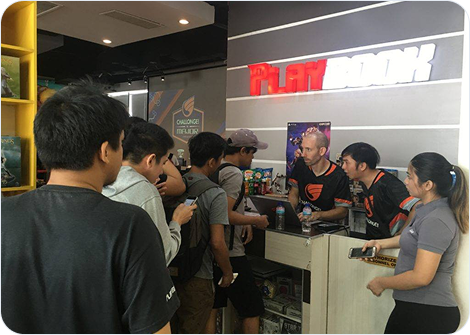
Me and the CTO checking-in participants.
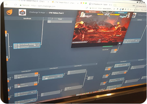
Challonge to Major tournament bracket in action.
Feedback, right where the work happens
A common piece of feedback we receive from tournament organizers is that, while they appreciate Challonge adding more features, the adoption process can be challenging due to inconsistencies in the user experience.
For instance, creating a tournament can feel very different from setting up a new community, even though they could share similarities if designed with consistency and scalability in mind.
Mark J.
Tournament organizer
"We use Challonge to organize most of our tournaments because it's a piece of cake to setup. We do appreciate adding Events and Communities to the mix, but our team isn't exactly encouraged to touch these two since the way they look and work is totally different from the tournament management side of things. Sure, there are some differences when creating a tournament vs an event or community. But I think the overall process should somehow still be the same right? It'd be awesome if it felt more familiar with how we setup tournaments at least."
How a disjointed user experience affects the team
This problem doesn't only affect the users, but it also affects the team in different ways as well.
Inconsistency
As a product that has been in existence for more than a decade, Challonge was designed by numerous designers with varying styles, resulting to inconsistency of the app's design.
Increased dev time
There are times where there is a need to reinvent the wheel each time we work on a new feature, which can slow down the development process.
Maintenance
Updating and maintaining UI can become a cumbersome task, as changes in one part of the application may not easily be applied to other areas.
Selling the idea to the team
As this project will require a considerate amount of time and effort from the whole team, I need to ensure that they would understand the value of starting the foundations of a design system through a presentation aimed at securing their approval to go through with this project.
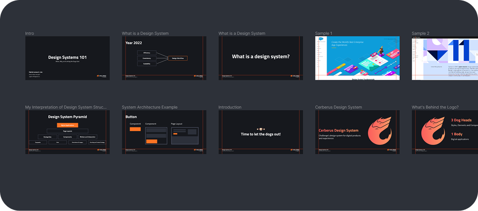
Design system presentation done using the newly released Figma Slides in 2022.
Design
After securing the approval of the project, we then established the deliverables to ensure that this would be used properly after release.
The components that we did were divided into two categories:
Low-traffic pages / Short-term vision
These are components aimed at low-traffic pages like Settings and Terms & Conditions page. These pages would allow us to experiment new components as there would only be a small impact after its release.
High-traffic pages / Long-term vision
These are components aimed at high-traffic pages like the homepage, tournament bracket, and profile pages. These components should be more stable and reliable as they would have a large impact after its release.
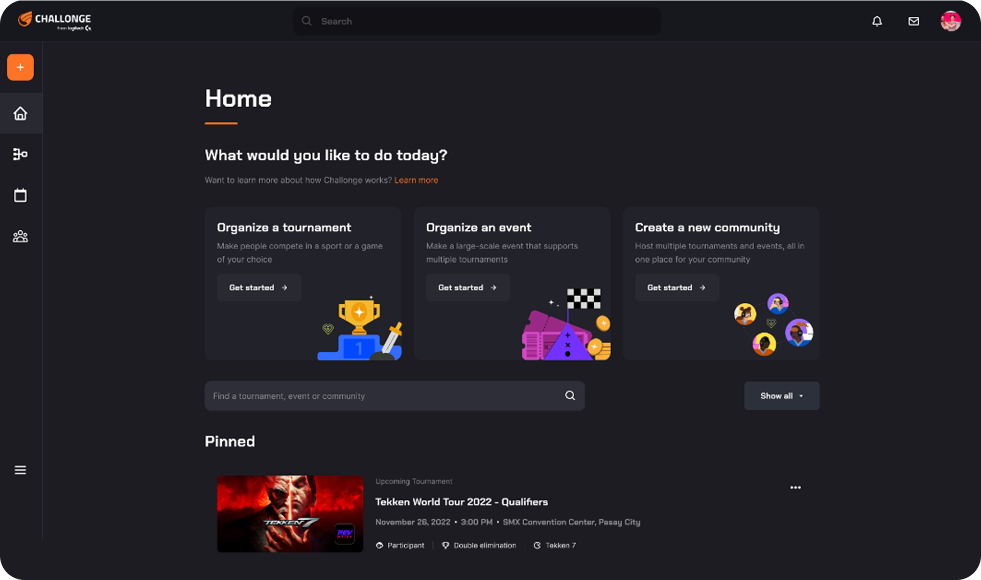
Initial components designed
After establishing the foundational styles like Colors, Typography, Spacing, and the like, the initial components that I designed were the Top Navigation, Left Navigation, Cards, and the Footer. The mockup below shows the updated Challonge dashboard, the first screen that was made through combining all the components.
Diving into project management
After getting approval for the styles and components, I volunteered to wear a different hat and lead the management of this project. I presented a diagram showcasing my thinking around how the project could be sliced, then proceeded to put these tasks into Productboard for tracking.
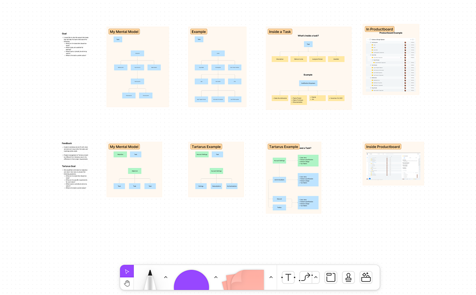
Left: Presentation done using the recently released Figjam in 2022.
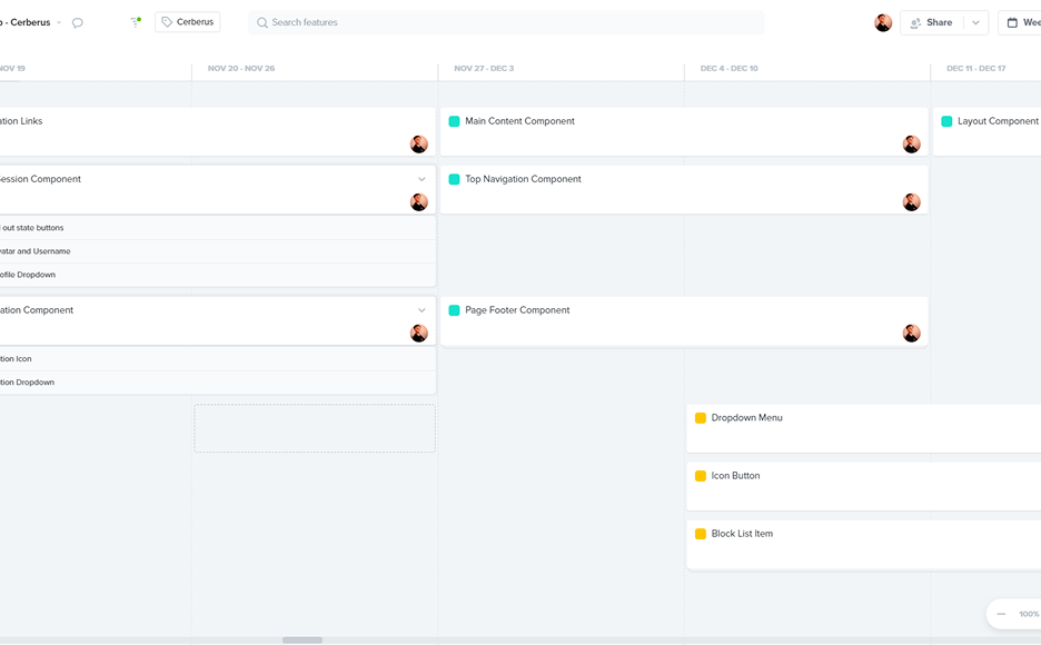
Right: Project Management done using Productboard.
Showcase
Showing some of the initial foundational styles and components that were sent for delivery after the designs have been approved.
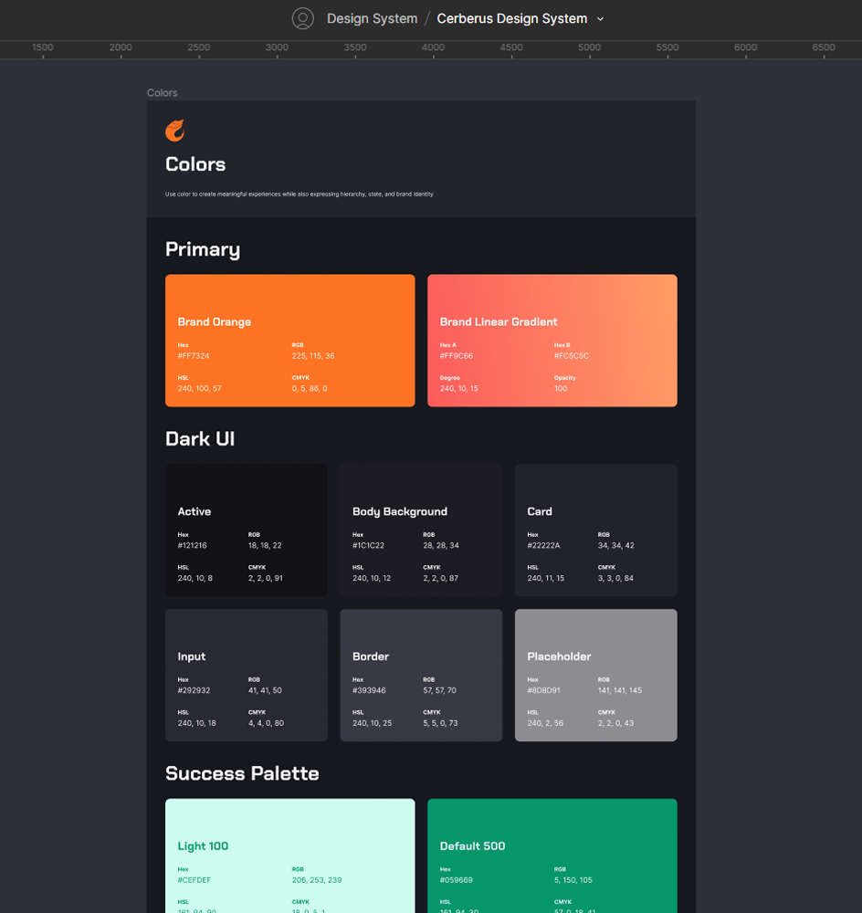
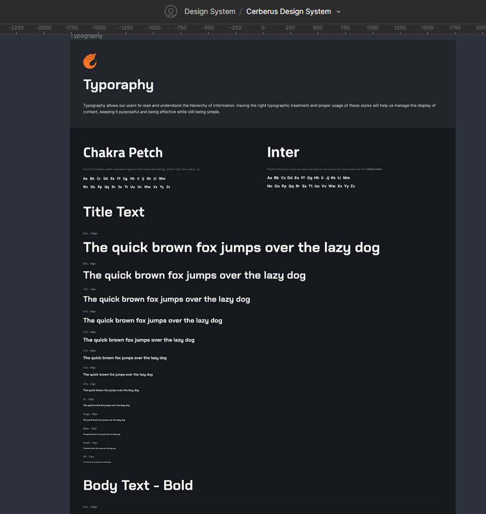
Foundational Styles & Components
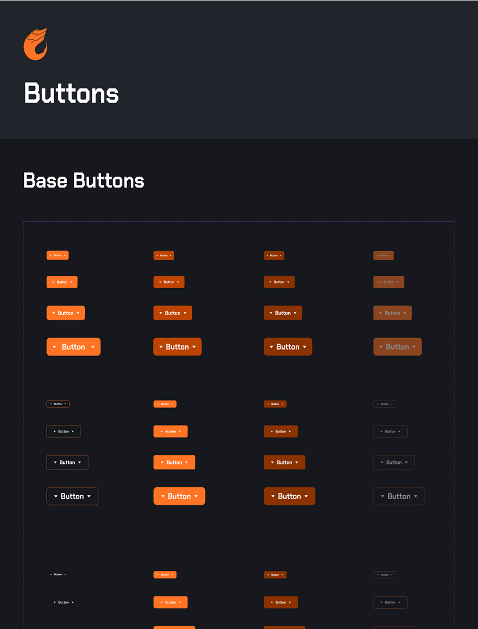
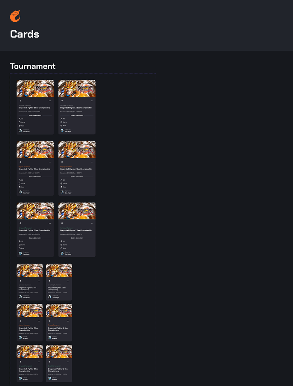
Button and Card Components
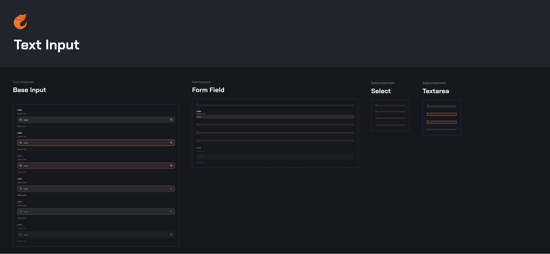
Text Input Component
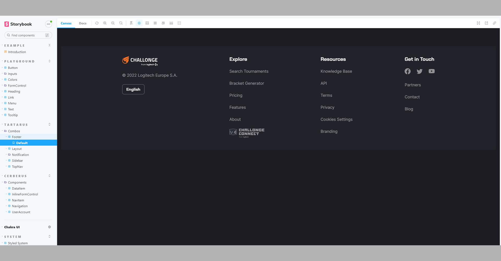
Footer Component developed by me using React, TailwindCSS and Storybook.
Thank you for reading
This case study showcases the design process behind creating Challonge's foundational design system. If you'd like to see more of my work, feel free to explore other projects.
Back to Home