
Redefining the job requisition experience: a visionary platform redesign driven by user discovery and validation
Establishing modern, standardized UI patterns for PageUp's Jobs Platform, earning key stakeholder validation and a prestigious company award nomination.
About
PageUp is an AI-powered talent acquisition platform designed to streamline hiring and connect people. By leveraging advanced automation, the platform delivers personalized experiences at scale. This case study showcases how a design discovery phase helped redefine the future of one of PageUp's most-used features.
Team
We are following the product trio model based from Teresa Torres' Continuous Discovery Habits.
- A trio composed on 1 Designer, 1 Product Manager, and 1 Tech Lead.
- The trio is also supported by 3 software developers as the project goes through delivery.
Goals
HMW Questions
- How might we simplify and streamline the job requisition process within PageUp?
- How might we simplify the way infrequent and advanced users navigate inside PageUp?
Business Goal
- Develop and validate high-confidence designs for long-term job card structural components within the context of a global platform Shell and Information Architecture structure.
Outcomes
- Designs secured approvals from all key stakeholders, moving the project to delivery phase.
- I was nominated for CEO awards in Q4 2023, an achievement that is not easily achieved by employees during their first year.
- Design components have been lined up for development, starting with the Page Header and Vertical Content menu.
User Types
Recruiter
Primary pain point:
A recruiter typically has to manage recruitment for multiple positions and the experience can be different depending on where they are in the platform.
Consequence:
Inconsistency and confusion around the current experience causes operational inefficiency and frustration among recruiters.
Need:
A consistent and clear experience of creating a new job requisition for their organization.
Hiring Manager
Primary pain point:
Hiring is not a part of their day-to-day responsibility. As such, they do not engage with the platform as often. Because of that, they are often more frustrated and confused than a recruiter.
Consequence:
A confusing and inconsistent experience causes time-to-hire take longer, which causes a net negative in the operations of their organization.
Need:
A consistent and clear experience of creating a new job requisition for their organization.
Discovery
Following an initial Design Sprint with executive leadership to validate the project's scope, I took ownership of the prototyping and assisted with the research phase. I developed the test-ready prototype and processed user feedback into the actionable insights that informed our long-term strategy.
Left: Design Sprint prototype.
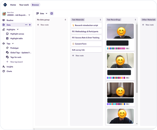
Right: Usability test sessions managed using Dovetail.
Discovery Insights
- PageUp's job requisition process is currently hindered by its inherent complexity, which fails to accommodate the diverse needs of its user base.
- This creates a dual-sided challenge: infrequent users lack the confidence to initiate hire or backfill requests, leading to operational delays. Conversely, power users who prioritize speed find their efficiency throttled by the system's cumbersome design.
In the following months, the project officially began with a kickoff meeting involving the Head of UX, Senior UX Designer, Product Manager, Tech Lead, and UX Operations Manager. Our goal was to ensure cross-functional alignment before diving into execution.
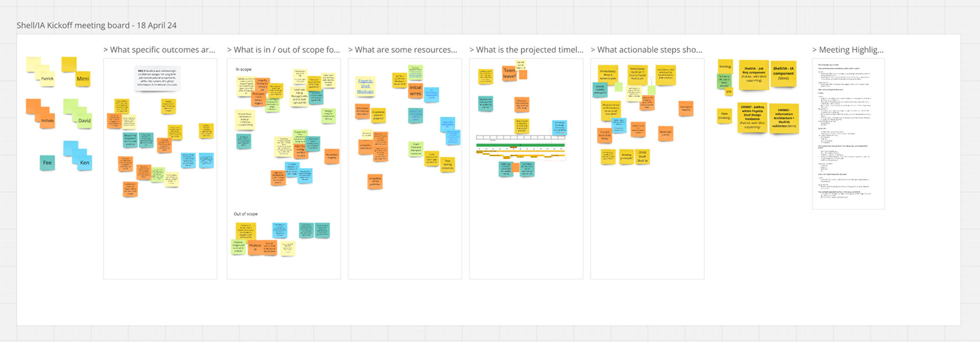
Kickoff meeting with cross-functional team members.
Ideation
Following an initial Design Sprint with executive leadership to validate the project's scope, I took ownership of the prototyping and assisted with the research phase. I developed the test-ready prototype and processed user feedback into the actionable insights that informed our long-term strategy.

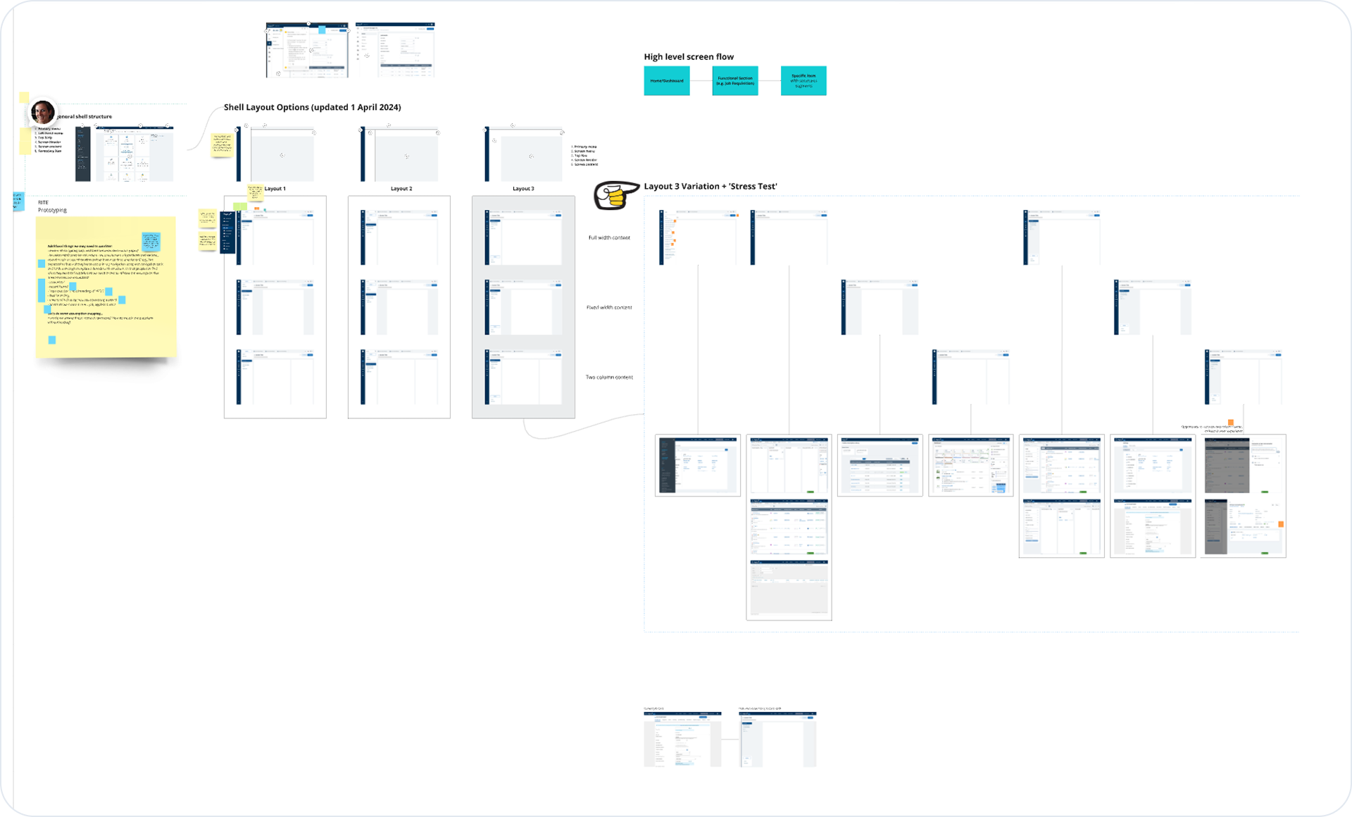
Project structure and information architecture.
Following an initial Design Sprint with executive leadership to validate the project's scope, I took ownership of the prototyping and assisted with the research phase. I developed the test-ready prototype and processed user feedback into the actionable insights that informed our long-term strategy.
Design
I transitioned from ideation to prototyping, creating a flow for usability testing with both primary user types. This prototype centered on the job requisition process, ensuring a seamless collaborative experience for both the Hiring Manager and the Recruiter.
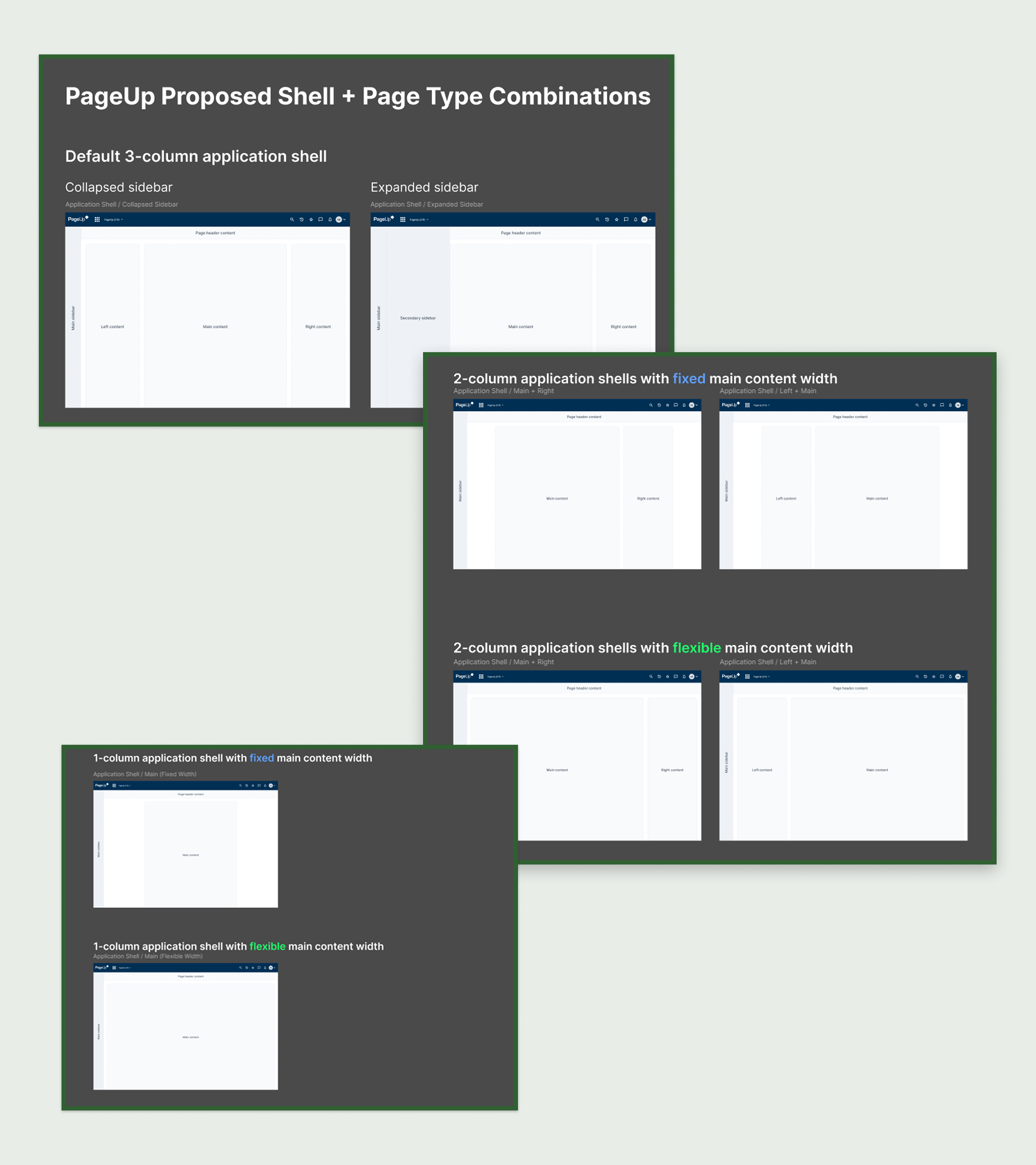
Implementing the persistent Shell structure
I moved the primary Jobs navigation into a left-hand Shell structure. This provides users with a constant sense of place within the broader PageUp ecosystem. By anchoring the global navigation to the left, we reclaimed vertical space and allowed the core content to breathe.
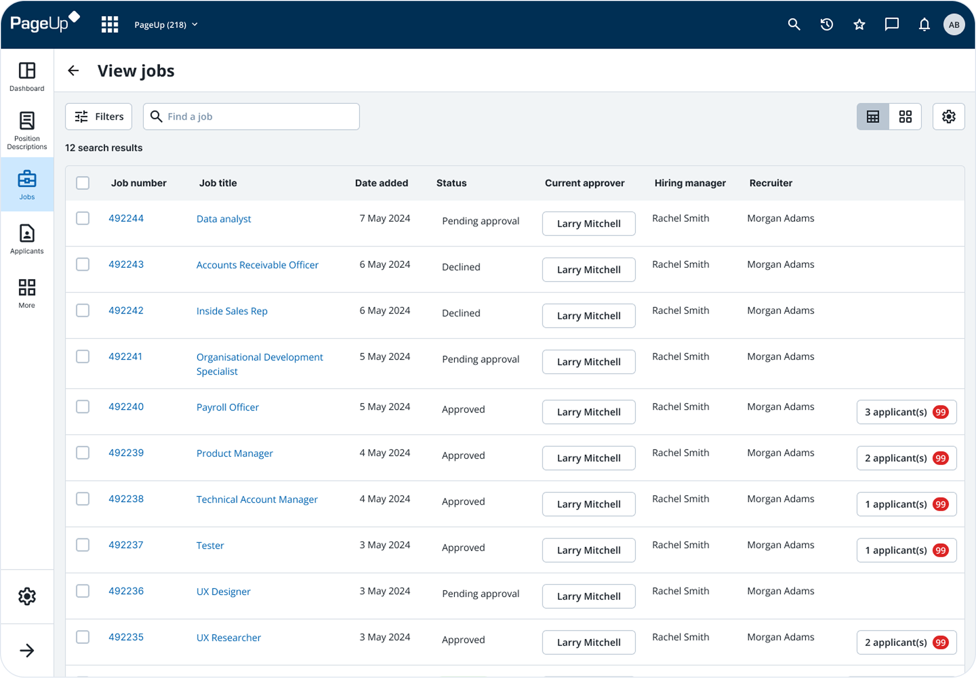
Redesigned PageUp Jobs Table
Card-Based Architecture & Design System Alignment
Using our current design system, I transitioned the layout from a continuous, overwhelming list of fields to a card-based UI.
- Information Chunking: By grouping related fields into logical containers (e.g., 'Recruitment Request'), I reduced the user's cognitive load.
- Visual Clarity: I cleaned up the form inputs and alignment, ensuring the interface feels modern, professional, and trustworthy.
- Persistent Actions: I optimized the header to keep primary actions, like 'Submit for Approval,' always within reach, removing the need for users to scroll to the bottom of the page to save their work.
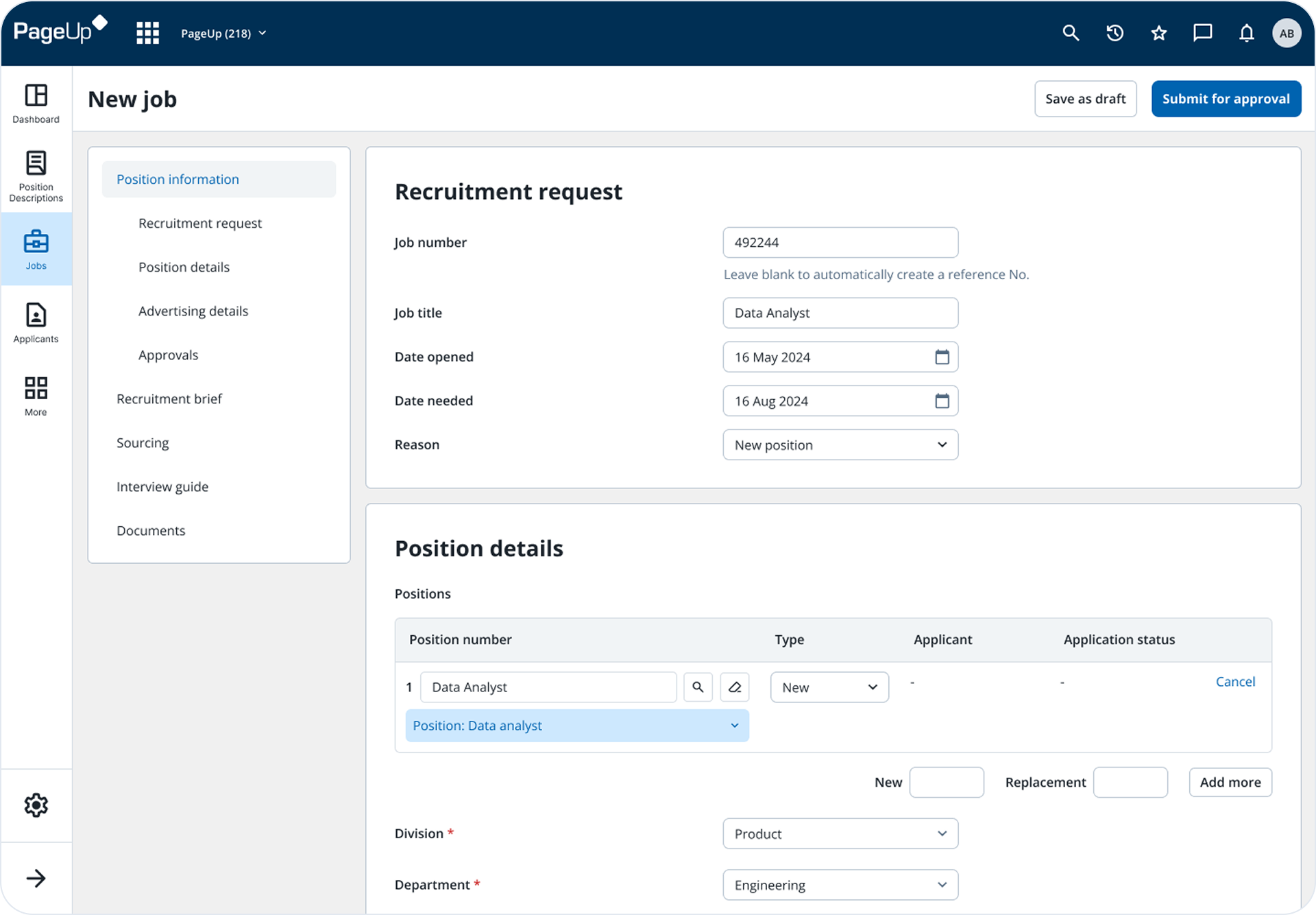
Card-based form design with improved information architecture.
Aspirational Features
To make the best use of our time and as a way to maximize the window of opportunity that we have with our ideas, I also designed the following aspirational features that would be tested with the users:
- Waffle Menu: Allow the user to navigate between different PageUp modules.
- Favorites: Manage dozens of job requisitions simultaneously.
- Notifications: Alerts users to approvals, comments or status changes in real-time.
- History: Track user's recent activity to resume their work instantly.
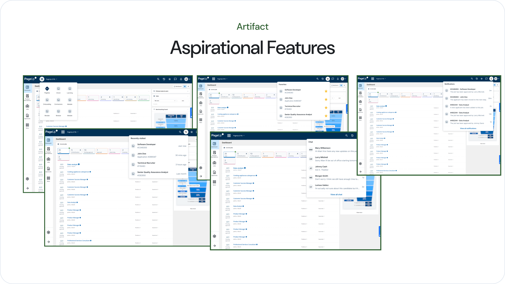
Aspirational Features
Validation
For this round of usability tests, we managed to test it with 6 recruiters and 6 hiring managers. Each session is 45 minutes which shows the following flows:
- Creating a new job
- Viewing job status and approval
- Approving a job
- Declining a job
- Aspirational features
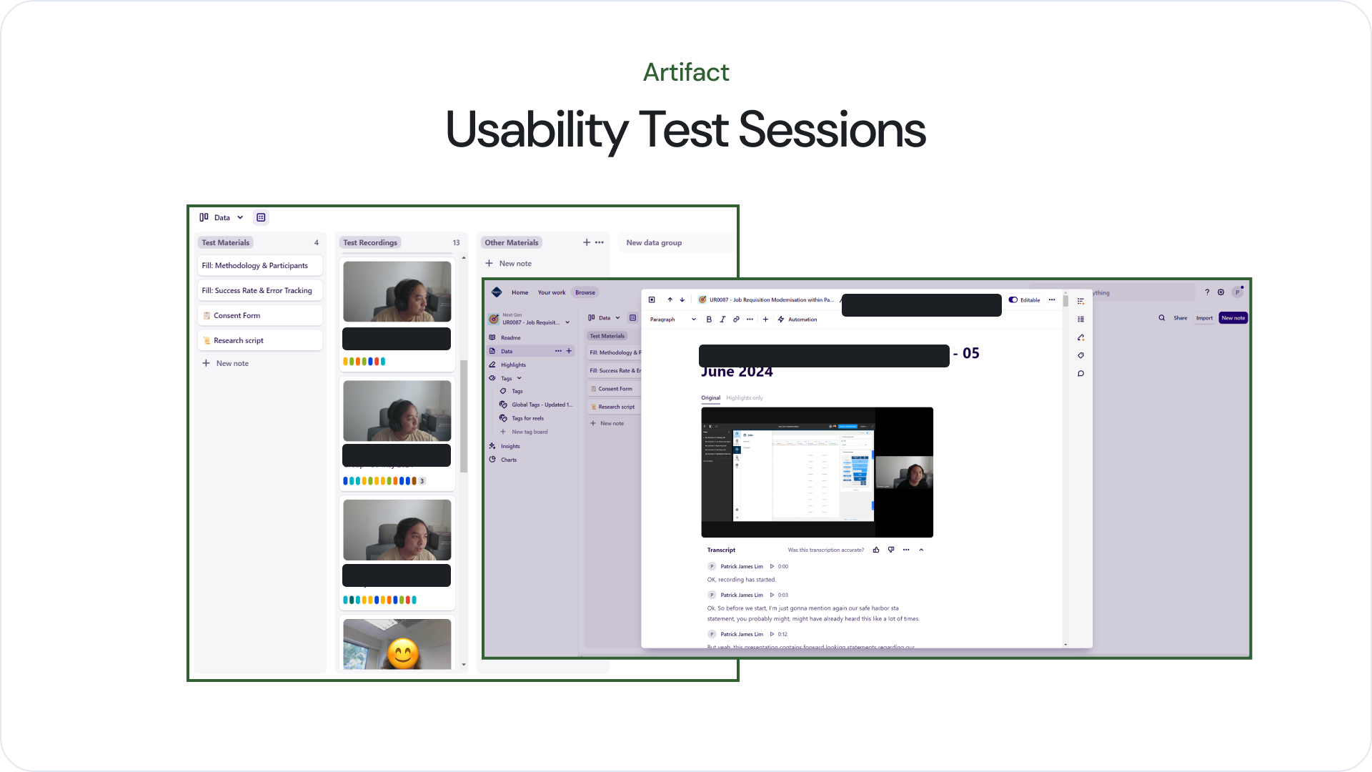
Usability test sessions managed using Dovetail.
What Worked Well
Participants responded positively to the following experiences:
- New platform Shell structure
- Vertical navigation changes
- Jobs table with approval process popover
What Didn't Work
Participants did not respond well to the following:
- Chat inside PageUp
Discovered Opportunities
We found opportunities to explore more of the following:
- Sorting and filtering through table column headers
- History and Favorites
Thank you for reading
This case study showcases the design process behind redefining PageUp's job requisition experience. If you'd like to see more of my work, feel free to explore other projects.
Back to Home